Choosing a honeycomb wrap colour that fits your brand
How to pick a honeycomb paper colour for your brand: five questions on visibility, product contrast, box colour, message and stock, with a worked example.
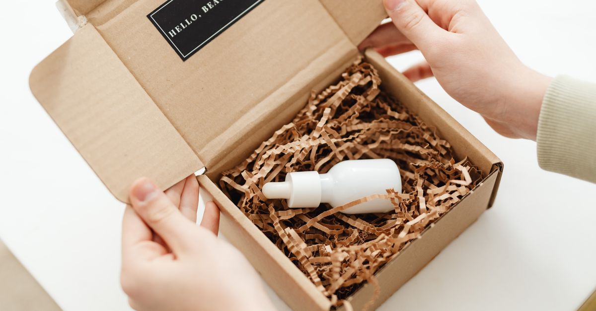
The right honeycomb wrap colour is the one that makes your product look good when the box opens, and that your team can keep in stock without fuss. Start with one question: does your customer see the wrap at all? If not, natural kraft is the answer.
If they do, choose for contrast with the product and the box interior. Copying your logo colour is the usual mistake. Then check that the colour sends the message you want, and that you can carry one more SKU.
We make honeycomb paper in Jaipur in seven colours: natural brown kraft, white, black, blue, green, red and yellow. So I have every reason to sell you colour. That is also why I want you to choose it for a business reason, and not because a mood board looked nice.
Does anyone actually see the wrap?
This question decides more than all the others put together.
If your parcels go to trade buyers, warehouses, marketplaces or a returns desk, the wrap is invisible in practice. Nobody photographs it.
Colour then adds cost and gives nothing back.
If your parcels go to consumers who open them at home, the wrap is often the first thing they see after the lid. Then it is part of your brand, whether you planned it or not.
Many sellers sit in between: some orders are gifts, some are trade. In that case I would keep natural kraft as the base, and keep colour for the channel where people really open the box.
If you import, we can load brown and one colour in the same container, as long as each one fills at least 4 pallets.
Five questions that choose the colour
Answer these in order. I find that by the fourth question, most brands already have their colour.
- What colour is the product? The wrap should frame it. Light and shiny products look best on dark wrap. Dark products need light wrap. Natural products such as wood, clay and food look at home on brown kraft.
- What colour is the inside of the box? The customer sees the box interior, then the wrap, then the product. Three strong colours in a row look busy. Two that contrast, plus a neutral, usually look calm.
- What does the colour say? Brown kraft says paper and practical. White says clean and simple. Black says special. Bright colours say fun or festive. Green can suggest an environmental promise, which is fine only if you can back it up.
- Can you hold it in stock? Every colour is one more SKU to forecast, store and reorder. If you would forget to reorder it during your busy season, choose fewer colours.
- Does it survive a phone photo? Customers share unboxings from a phone, often under warm kitchen light. Some blues and greens look quite different there than in a studio.
Matching the logo is usually a mistake
The temptation is natural. The logo is teal, so the wrap must be teal.
It can be done. We make any colour to order with a minimum order of 8 pallets of one colour in one width, while brown, white and black sit in regular stock and red, blue, yellow and green are usually in stock. But even when you can have it, I would think twice, for two reasons. First, kraft paper is not a white canvas. A coloured kraft will come close to a printed brand colour, but rarely matches a Pantone swatch exactly, and the two side by side in one box make the difference obvious. Second, a strong brand colour on the box, the wrap and the card at once tires the eye.
I would use the brand colour once, as an accent.
A printed card, a sticker on the wrap, a ribbon or a branded paper tape carries the logo colour well. The wrap can then be brown, white or black, and the whole presentation still looks like you.
A table to start from
Treat these as starting points. Your product and your box decide.
| Your brand and product | Colour to try first | Second option |
|---|---|---|
| Handmade, natural, rustic, food gifts | Natural brown kraft | White |
| Skincare, cosmetics, wellness | White | Natural brown kraft |
| Jewellery, watches, gold and silver decor | Black | White |
| Glassware, crystal, perfume | Black | White |
| Children's products, playful brands | Yellow, blue or red | White |
| Plant, garden and outdoor brands | Green | Natural brown kraft |
| Festive and gift ranges | Red or green, for the season only | Natural brown kraft |
| Trade, wholesale and warehouse orders | Natural brown kraft | None needed |
Our guides to coloured honeycomb paper and black honeycomb paper go deeper into the checks for each colour. If the choice is only between natural and white, our comparison of white and brown honeycomb paper is the shorter read.
A worked example
Picture a skincare brand in Melbourne that ships about 150 orders a day. Every detail here is invented for the example. Its products come in frosted glass jars of 50, 100 and 200 ml, with gold lids. Its mailer box is brown kraft outside and printed sage green inside. Its logo is sage green too.
The tempting answer is a green wrap. Run the five questions instead.
- Product: frosted glass and gold, which is light and shiny. It will stand out on white or black.
- Box interior: sage green. Green wrap on green print would merge into one colour. White or black would contrast.
- Message: the brand sells "clean and gentle". Black reads a little dramatic for that. White fits.
- Stock: one colour across all three jar sizes, so one SKU. At 150 orders a day, running out of a special colour in December would hurt.
- Phone photo: white wrap on sage green, with a gold lid in the middle, photographs clearly.
The answer here is white, with the sage green kept for the box print and a small printed card. The logo colour appears twice, and the wrap does its job quietly.
A different brand, with dark amber bottles and a black box, would land somewhere else entirely. That is the point of the questions.
What a colour costs you in operations
Colour has a cost beyond the price per roll. It is easy to forget at the design stage.
- Stock. Each colour needs its own safety stock, worked out from its own monthly usage.
- Containers. If you import, we plan at least 4 pallets per item in a mixed container, and each colour and size counts as an item. At 40 rolls per pallet for 380 mm x 250 m rolls, that is 160 rolls of each colour.
- Packers. Two colours on one bench means someone, one day, picks the wrong one. One colour per station avoids it.
- Shade. Coloured paper made months apart may differ a little. A brand that cares about an exact shade has to hold an approved sample and compare each delivery with it, which is one more small job.
For most brands I would recommend one wrap colour for everything, plus at most one seasonal colour.
We would happily sell you seven. I just do not think you need them. Our post on holiday packing with coloured honeycomb paper explains how to plan a seasonal colour without being left with stock in January.
Decide with real samples
Colour on a screen lies.
Paper changes with light, and kraft fibre gives every colour a slightly warm, textured look that a screen cannot show.
So I would order samples of your two closest alternatives. Wrap your real product, put it in your real box, and take a photo on a phone in an ordinary room. Show both photos to three people who know your customers. That half-hour usually settles it.
Send us your product, your box colour and the two colours you are deciding between. We will send samples of both in the width you use, and we will tell you honestly if we think brown would do the job. You can reach us through the contact page, and the full range is on our products page.
Questions buyers ask
Should the wrap be the same colour as my logo?
Usually not. A wrap in the logo colour often fights with the printed box and the product. I would use the brand colour once, as an accent on a card, sticker or tape, and let the wrap be the quiet background.
Can I use a different wrap colour for each product line?
You can, but count the cost first. Each colour is a separate SKU with its own stock and forecast, and packers have to pick the right one every time. Most brands do better with one wrap colour across the range.
Does natural brown kraft look cheap?
Not in my view. It looks like paper, which is what many customers want to see. Next to a well-printed box and a neat card, brown kraft reads as honest and practical. It only looks cheap when the packing itself is untidy.
Is white or brown better for a premium brand?
It depends on the product. White suits light, clean, minimal products and cosmetics. Brown suits natural, handmade and food brands. Black suits shiny or light products that need contrast. Test the two closest options side by side.